Thank you for purchasing Enormous template. This documentation will help to know more about template and how is structured and how to use the template features.
Enormous is a template for multi purpose sites built on Bootstrap Framework, AIDA marketing model and Principles of Conversion Centered Design, You can start to use template.html where all main files are already included and ready to use.
Requirements
To be able to use HTML template, you must have the following:
- PHP (for contact page)
- Apache webserver (Windows servers will probably work, but are not supported)
- An FTP tool to upload the files
- Make sure you upload the required assets files/folders listed below:
HTML/assets/css- Extra Stylesheets FolderHTML/assets/include- Required PHP Functions FolderHTML/assets/images- Images FolderHTML/assets/js- Javacripts FolderHTML/assets/revolution- revolution slider FolderHTML/assets/css/style.css- Main Stylesheet FileHTML/index.html- Index File/Homepage
Installation
Follow the steps below to get started with your Enormous Template:
- Open the
Package/HTMLFolder to find all the html Templates Files - You will need to Upload these files to localhost server or your Web Server using FTP in order to use it on your Website.
- Make sure you upload the required files/folders listed below:
HTML/assets- Required all file Folder.- Select
HTML/home-1.htmlwhich want to use. - change
HTML/index.htmlname file toHTML/index.html- Index File
File Structure
unzip the compressed archive to see the following structure:
 Enormous/
  ├── Documentation/
  ├── HTML/
      ├── assets/
          ├── css
          ├── icons
          ├── images
          ├── fonts
          ├── js
          ├── less
          ├── revolution
          └── php
      ├── index(intro)
      ├── home-1.html
      ├── ...
      └── cotact-us.html
Html Structure
we use the bootstrap framework as a framework. You can take a look at bootstrap here and see it's feature in action.
And basic layout of the grids look like:
<div class="row">
  <div class="col-sm-9">
    Level 1: .col-sm-9
    <div class="row">
      <div class="col-xs-8 col-sm-6">
        Level 2: .col-xs-8 .col-sm-6
      </div>
      <div class="col-xs-4 col-sm-6">
        Level 2: .col-xs-4 .col-sm-6
      </div>
    </div>
  </div>
</div>
If you find that you need to change structure. Scroll down in your html file and find section that you want to change , all section have predefined html comments like below section example.
CSS Structure
Here's a list of the stylesheet files I'm using with this template, you can find more information opening each file:
| File Name | Description |
|---|---|
bootstrap.min.css |
This are generic styles, resets & normalization.you can take a look here add see it's feature in action. |
external.css |
This is a bunch of cool, fun, and minify for all external css resources you can found this resources in css folder. |
style.css |
This is the main css file, it contains all the styles of the website. |
custom.css |
To Be Safe, We recommend you writing your rules and style declarations here and just override the previous rules. So in case i make an update you can just replace the stylesheet. |
Less CSS Structure
Here's a list of Less CSS files I'm using with this template, you can find more information opening each file:
| File Name | Description |
|---|---|
style.less |
This are generic styles and collect all files. |
Base Folder |
This folder contain base less css file and variable file. If you want to change any variable you can go through it. |
Layout Folder |
This folder contain layout less css files like accordion, align, background, list and etc.. |
Module Folder |
This folder contain block and section less css files like action, feature, screenshot, etc... |
State Folder |
This folder contain state cases like on, off button and contains responsive less css file. |
theme folder |
This folder contain color less css file like theme-red.less, theme-yellow.less, theme-purple.less, theme-pink.less, etc... |
Javascript Structure
The js (scripts) files are loaded in footer. I loaded js Library in the bottom because it will increase the site speed and rendering.
The JS files used in this template are:
| File | Description |
|---|---|
jquery-2.2.4.min.js |
jQuery is a Javascript library that greatly reduces the aEnormous of code that you must write. |
bootstrap.min.js |
this bring Bootstrap's components to life with over a dozen custom jQuery plugins. Easily include them all, or one by one. |
plugins.js |
this bring all javascript plugins to life which we compresed all plugins to min. |
functions.js |
this to active javascript function and add some coll function to your landing page. |
wow.min.js |
this is a JavaScript plugin that reveals animations when you scroll. Very Animate.css friend,Easily customize animation settings: style, delay, length, offset, iterations... |
jquery.ajaxchimp.js |
AjaxChimp is a jQuery plugin that lets you ajaxify your mailchimp form. |
jquery.counterup.js |
Counter-Up is a lightweight jQuery plugin that counts up to a targeted number when the number becomes visible |
less.min.js |
This is the JavaScript, official, stable version of Less. Getting Started. Options for adding Less CSS to your project. |
owl.carousel.min.js |
jQuery plugin that lets you create beautiful responsive carousel slider. |
html5shiv.js |
This script is the defacto way to enable use of HTML5 sectioning elements in legacy Internet Explorer. |
respond.min.js |
this script is to provide a fast and lightweight (3kb minified / 1kb gzipped) script to enable responsive web designs in browsers that don't support CSS3 Media Queries. |
Using LESS CSS
To work with less css, Just add to head section in your index.html less library code with main less style file.
<link rel="stylesheet/less" type="text/css" href="assets/less/style.less" />
<script src="assets/js/less.js" type="text/javascript"></script>
Loading Screen
You can use loading screen spinners.
Here's a loading screen I'm using with this template, you can select/change what you need and use it:
<div class="preloader">
	<div class="spinner">
		<div class="bounce1">
		</div>
		<div class="bounce2">
		</div>
		<div class="bounce3">
		</div>
	</div>
</div>
Change Fonts
To change the font, Check head inindex.html then in first go to google fonts choose a font and use the generated code and replace with next code.
<!-- Fonts
============================================= -->
<link href='http://fonts.googleapis.com/css?family=Raleway:400,100italic,100,200,200italic,300,300italic,400italic,500,500italic,600,600italic,700italic,700,800,800italic,900,900italic%7COpen+Sans:400,300,300italic,400italic,600,600italic,700,700italic,800,800italic%7CUbuntu:400,300,300italic,400italic,500,700,500italic,700italic%7CRoboto+Slab:400,100,300,700%7CLora:400,400italic,700,700italic' rel='stylesheet' type='text/css'>
Next Step : change font family for body in style.css
body {
	font-family: "Raleway", Arial, sans-serif;/*Change font*/
}
h1,h2,h3,h4,h5,h6{
	font-family:"Ubuntu", Arial, sans-serif;/*Change font*/
}
Change Spacing
we uses helper classes to space elements on Enormous template. Helper classes are used to space elements with margin and padding. This makes it easier to create your own elements in HTML without needing extra CSS to arrange them appropriately.
AVAILABLE CLASSES
/* All margin */
.m-0 {
	margin: 0;
}

.m-xs {
margin:(@baseline/2);
}

.m-sm {
 margin:@baseline;
}

.m-md {
margin:@baseline*2;
}

.m-lg {
margin:@baseline*4;
}

/* top margin */
.mt-0 {
	margin-top: 0;
}

.mt-xs {
margin-top:(@baseline/2);
}

.mt-sm {
 margin-top:@baseline;
}

.mt-md {
margin-top:@baseline*2;
}

.mt-lg {
margin-top:@baseline*4;
}

.mt-30 {
	margin-top: 30px !important;
}

.mt-50 {
	margin-top: 50px !important;
}

.mt-60 {
	margin-top: 60px;
}

.mt-150 {
	margin-top: 150px;
}

/* bottom margin */
.mb-0 {
	margin-bottom: 0 !important;
}

.mb-xs {
margin-bottom:(@baseline/2);
}

.mb-15 {
	margin-bottom: 15px;
}

.mb-sm {
 margin-bottom:@baseline;
}

.mb-md {
margin-bottom:@baseline*2 !important;
}

.mb-lg {
margin-bottom:@baseline*4;
}

.mb-30 {
	margin-bottom: 30px !important;
}

.mb-50 {
	margin-bottom: 50px!important;
}

.mb-60 {
	margin-bottom: 60px!important;
}

.mb-100 {
	margin-bottom: 100px!important;
}

.mb-150 {
	margin-bottom: 150px!important;
}

/* right margin */
.mr-0 {
	margin-right: 0;
}

.mr-xs {
margin-right:(@baseline/2);
}

.mr-sm {
 margin-right:@baseline;
}

.mr-md {
margin-right:@baseline*2;
}

.mr-lg {
margin-right:@baseline*4;
}

.mr-30 {
	margin-right: 30px !important;
}

.mr-50 {
	margin-right: 50px;
}

.mr-60 {
	margin-right: 60px;
}

.mr-150 {
	margin-right: 150px;
}

/* left margin */
.ml-0 {
	margin-left: 0;
}

.ml-xs {
margin-left:(@baseline/2);
}

.ml-sm {
 margin-left:@baseline;
}

.ml-md {
margin-left:@baseline*2;
}

.ml-lg {
margin-left:@baseline*4;
}

.ml-30 {
	margin-left: 30px !important;
}

.ml-50 {
	margin-left: 50px;
}

.ml-60 {
	margin-left: 60px;
}

.ml-150 {
	margin-left: 150px;
}

/* All padding */
.p-0 {
	padding: 0;
}

.p-xs {
padding:(@baseline/2);
}

.p-sm {
 padding:@baseline;
}

.p-md {
padding:@baseline*2;
}

.p-lg {
padding:@baseline*4;
}

/* top padding */
.pt-0 {
	padding-top: 0 !important;
}

.pt-xs {
padding-top:(@baseline/2);
}

.pt-sm {
 padding-top:@baseline;
}

.pt-md {
padding-top:@baseline*2;
}

.pt-lg {
padding-top:@baseline*4;
}

.pt-30 {
	padding-top: 30px !important;
}

.pt-50 {
	padding-top: 50px !important;
}

.pt-60 {
	padding-top: 60px;
}

.pt-100 {
	padding-top: 100px !important;
}

.pt-150 {
	padding-top: 150px !important;
}

/* bottom padding */
.pb-0 {
	padding-bottom: 0 !important;
}

.pb-xs {
padding-bottom:(@baseline/2);
}

.pb-sm {
 padding-bottom:@baseline;
}

.pb-md {
padding-bottom:@baseline*2;
}

.pb-lg {
padding-bottom:@baseline*4;
}

.pb-30 {
	padding-bottom: 30px;
}

.pb-50 {
	padding-bottom: 50px;
}

.pb-60 {
	padding-bottom: 60px;
}

.pb-100 {
	padding-bottom: 100px !important;
}

/* right padding */
.pr-0 {
	padding-right: 0;
}

.pr-xs {
padding-right:(@baseline/2);
}

.pr-sm {
 padding-right:@baseline;
}

.pr-md {
padding-right:@baseline*2;
}

.pr-lg {
padding-right:@baseline*4;
}

.pr-15 {
	padding-right: 15px !important;
}

.pr-30 {
	padding-right: 30px !important;
}

.pr-50 {
	padding-right: 50px;
}

.pr-60 {
	padding-right: 60px;
}

.pr-150 {
	padding-right: 150px;
}

/* left padding */
.pl-0 {
	padding-left: 0;
}

.pl-xs {
padding-left:(@baseline/2);
}

.pl-sm {
 padding-left:@baseline;
}

.pl-md {
padding-left:@baseline*2;
}

.pl-lg {
padding-left:@baseline*4;
}

.pl-15 {
	padding-left: 15px;
	;
}

/* Postions */
.fixed {
	position: fixed;
}

.relative {
	position: relative;
}

.absolute {
	position: absolute;
}

.static {
	position: static;
}

/* Zindex*/
.zindex-1 {
	z-index: 1;
}

.zindex-2 {
	z-index: 2;
}

.zindex-3 {
	z-index: 3;
}

/* Borders */
.border-all {
border:        1px solid @color-theme;
}

.border-top {
border-top:    1px solid @color-theme;
}

.border-bottom {
border-bottom: 1px solid @color-theme;
}

.border-right {
border-right:  1px solid @color-theme;
}

.border-left {
border-left:   1px solid @color-theme;
}

/* Display */
.inline {
	display: inline;
}

.block {
	display: block;
}

.inline-block {
	display: inline-block;
}

.hide {
	display: none;
}

.flex {
	display: flex;
}

@media only screen and (max-width : 767px ) {

section {
	padding-top: 60px;
	padding-bottom: 60px;
}

.text-center-xs {
	text-align: center !important
}

.pull-none-xs {
	float: none !important;
	text-align: center !important
}

.mb-15-xs {
	margin-bottom: 15px;
}

.mb-30-xs {
	margin-bottom: 30px !important;
}

.mb-50-xs {
	margin-bottom: 50px;
}

.mb-60-xs {
	margin-bottom: 60px!important;
}

.p-none-xs {
	padding-right: 0;
	padding-left: 0
}
}

@media only screen and (min-width : 768px) and (max-width : 991px) {

.text-center-sm {
	text-align: center !important
}

.mb-0-sm {
	margin-bottom: 0;
}

.mb-15-sm {
	margin-bottom: 15px;
}

.mb-30-sm {
	margin-bottom: 30px !important;
}

.mb-50-sm {
	margin-bottom: 50px;
}

.mb-60-sm {
	margin-bottom: 60px;
}

.pb-15-sm {
	padding-bottom: 15px;
}

.pb-30-sm {
	padding-bottom: 30px;
}

.pb-50-sm {
	padding-bottom: 50px;
}

.pb-60-sm {
	padding-bottom: 60px;
}
Change Color
yellow hats has a number of included colour schemes that you can switch to at any time. To switch colour schemes, simply replace color code in style.css with what you need.
<!-- COLORS -->
Primary Color   : #ffc527
Secondary Color : #5a5a5a
Body Color      : #828282
Heading Color   : #2f2f2f
Change Favicon
The main favicon is located in assets/images/favicon/favicon.ico replace with your own.
Rest of favicons for iphone/tablet are located in assets/images/favicon/apple-touch-icon.png replace with your own favicon.
<link href="assets/images/favicon/favicon.ico" rel="icon">
<link href="assets/images/favicon/apple-touch-icon.png" rel="apple-touch-icon"/>
Change logo
Just edit the logo-light.png from the folder assets/images/logo/ or open index.html and you should see the tag there:
<div class="navbar-header">
   <img class="logo center-block" src="assets/images/logo/logo-light.png" alt="logo">
</div>
Change background
You can use the backgorund image using the Following code:
<section class="bg-overlay bg-overlay-theme">
	<div class="bg-section" >
		<img src="assets/images/call/2.jpg" alt="Background"/>
	</div>
	<div class="container">
		<div class="row">
			<div class="col-xs-12 col-sm-12 col-md-8 col-md-offset-2">
				....
			</div>
			<!-- .col-md-8 end -->
		</div>
		<!-- .row end -->
	</div>
	<!-- .container end -->
</section>
We used class to add backgound to feature , call to action section and etc. you can find this backgorunds in images folderassets/images/bg, and you can Find this background in style.css.
/*------------------------------------*\
    #BACKGROUNDS
\*------------------------------------*/
.bg-theme{ background-color:@color-theme}
.bg-gray { background-color:@color-gray}
.bg-white { background-color:@color-white}
/* Background Image */
.bg-section {
	position: relative;
	overflow: hidden;
	z-index: 1;
	-webkit-background-size: cover;
	   -moz-background-size: cover;
	    -ms-background-size: cover;
	     -o-background-size: cover;
	background-size: cover;
	background-attachment: fixed;
	background-repeat: no-repeat;
	background-position: center center;
	width:100%;
	height:100%;
}
.....
You can choose between 3 Types of background overlay while creating your section, bg-overlay-light, bg-overlay-dark,bg-overlay-theme.
you can change background opacity from style.css
.bg-overlay-light:before {
	background-color: rgba(255,255,255, 0.6);
}

.bg-overlay-dark:before {
	background-color: rgba(47, 47, 47, 0.95);
}

.bg-overlay-theme:before {
	background-color: rgba(255, 197, 39, 0.9);
}
Change Icons
we use icon fonts with easy control in color and size so feel free to use more than 600 icon , you can check this icon:
- Font Awesome – http://fortawesome.github.io/Font-Awesome/cheatsheet/
- Stroke Gap Icons – https://www.behance.net/gallery/17079811/Stroke-Gap-Icons
- Linearicons – https://linearicons.com/free
<ul class="list-unstyled checklist">
    <li>
        <i class="fa fa-line-chart pull-left"></i>
        <h4 class="text-capitalize text-strong">conversion rate improvement</h4>
    </li>
    <li>
        <i class="fa fa-search pull-left"></i>
        <h4 class="text-capitalize text-strong">crawling search engine speedily</h4>
    </li>
    <li>
        <i class="fa fa-refresh pull-left"></i>
        <h4 class="text-capitalize text-strong">customize code quickly</h4>
    </li>
</ul>
Change Header
You can choose between 10 Types of headers while creating your Pages. Simply adding the Header Type CSS class to the Header Element and change the header structure that you need of go to header page template that you wnat and copy HTML code.
<header id="navbar-spy" class="transparent-header">
	<nav id="primary-menu" class="navbar navbar-fixed-top style-1">

	</nav>
</header>
primary menu
<ul class="nav navbar-nav navbar-left">

</ul>
dropdow menu
<li class="has-dropdown">
	<a href="#" data-toggle="dropdown" class="dropdown-toggle">about</a>
	<ul class="dropdown-menu">
		<li class="dropdown-submenu">
			<a href="#" data-toggle="dropdown" class="dropdown-toggle">about us</a>
			<ul class="dropdown-menu">
				<li><a href="about-1.php">about us 1</a></li>
				<li><a href="about-2.php">about us 2</a></li>
				<li><a href="about-me.php">about me</a></li>
			</ul>
		</li>
		<li class="dropdown-submenu">
			<a href="#" data-toggle="dropdown" class="dropdown-toggle">our team</a>
			<ul class="dropdown-menu">
				<li><a href="team-1.php">team 1</a></li>
				<li><a href="team-2.php">team 2</a></li>
			</ul>
		</li>
		<li><a href="testimonials.php">testimonials</a></li>
		<li><a href="faq.php">FAQS</a></li>
	</ul>
</li>
<!-- li end -->
mega menu
<li class="has-dropdown active">
	<a href="#" data-toggle="dropdown" class="dropdown-toggle">Home</a>
	<ul class="mega-menu">
		<li>
			<ul>
				<li><a href="home-1.php">home page 1</a></li>
				<li><a href="home-2.php">home page 2</a></li>
				<li><a href="home-3.php">home page 3</a></li>
				<li><a href="home-4.php">home page 4</a></li>
				<li><a href="home-5.php">home page 5</a></li>
				<li><a href="home-6.php">home page 6</a></li>
			</ul>
		</li>
		<li>
			<ul>
				<li><a href="home-7.php">home page 7</a></li>
				<li><a href="home-8.php">home page 8</a></li>
				<li><a href="home-9.php">home one page</a></li>
				<li><a href="home-10.php">home shop page</a></li>
				<li><a href="home-11.php">home architect</a></li>
			</ul>
		</li>


	</ul>
</li>
<!-- li end -->
Change Page Title
You can choose between 6 Types of page title while creating your Pages. Simply adding the page title section to your page and change the page title content with that you need, you can find all page title sections in elements-page-title.html.
<!-- Page Title #1
============================================= -->
<section class="bg-overlay bg-overlay-gradient pb-0">
	<div class="bg-section" >
		<img src="assets/images/page-title/2.jpg" alt="Background"/>
	</div>
	<div class="container">
		<div class="row">
			<div class="col-xs-12 col-sm-12 col-md-12">
				<div class="page-title title-1 text-center">
					<div class="title-bg">
						<h2>page titles</h2>
					</div>
					<ol class="breadcrumb">
						<li><a href="#">Home</a></li>
						<li class="active">page title</li>
					</ol>
				</div><!-- .page-title end -->
			</div><!-- .col-md-12 end -->
		</div><!-- .row end -->
	</div><!-- .container end -->
</section>
Change Heading
You can choose between 8 Types of heading section while creating your Pages. Simply adding the heading section to your section and change heading content with that you need, you can find all heading section in elements-heading.html.
<!-- Heading #1
============================================= -->
<section class="bg-gray">
	<div class="container">
		<div class="row">
			<div class="col-xs-12 col-sm-12 col-md-8">
				<div class="heading heading-1">
					<p>all about us</p>
					<h2>our stroy</h2>
					<p class="mb-0">Enormous is a leading developer of A-grade commercial, industrial and residential portfolio in USA. Since its foundation the company has doubled its turnover year on year, with its staff numbers swelling accordingly.</p>
				</div><!-- .heading end -->
			</div><!-- .col-md-8 end -->
		</div><!-- .row end -->
	</div><!-- .container end -->
</section>
Change Widget
You can choose between 9 widgets while creating your sidebar. Simply adding widget to your sidebar. you can find all widgets in elements-widget.html.
Contact Form
Just put your email address in file send.php at the folder assets/php/ and you should see the code there:
$to_Email = "[email protected]"; //Replace with recipient email address
Section Background & Parallax
Add Dark Backgroud to Section:
<section class="bg-dark">
    <div class="container">

        ...

    </div>
</section>
Add white Background to Section:
<section class="bg-white">
    <div class="container">

        ...

    </div>
</section>
Add gray Background to Section:
<section class="bg-gray">
    <div class="container">

        ...

    </div>
</section>
Set backround img to Section:
<section>
    <div class="bg-section">
        <img src="your img path">
    </div>
    <div class="container">

        ...

    </div>
</section>
Set backround img overlay to Section:
<section class="bg-overlay bg-overlay-dark">
    <div class="bg-section">
        <img src="your img path">
    </div>
    <div class="container">

        ...

    </div>
</section>
Setting up Parallax Sections:
Make sure your Parallax Images are of enough Width & Height, preferably 1920x1080 or above.
<section class="bg-parallax">
    <div class="bg-section">
        <img src="your img path">
    </div>
    <div class="container">

    ...

    </div>
</section>
Accordion elements-accordion.html
Screenshoot:
<div class="accordion accordion-1" id="accordion01">
<!-- Panel 01 -->
<div class="panel">
    <div class="panel--heading">
        <a class="accordion-toggle collapsed" data-toggle="collapse" data-parent="#accordion01" href="#collapse01-1">...</a>
    </div>
    <div> id="collapse01-1" class="panel--body panel-collapse collapse">
        ....
    </div>
</div>

<!-- Panel 02 -->
<div class="panel">
    <div class="panel--heading">
        <a class="accordion-toggle collapsed" data-toggle="collapse" data-parent="#accordion01" href="#collapse01-2">...</a>
    </div>
    <div id="collapse01-2" class="panel--body panel-collapse collapse">
        ....
    </div>
</div>

<!-- Panel 03 -->
<div class="panel">
    <div class="panel--heading">
        <a class="accordion-toggle" data-toggle="collapse" data-parent="#accordion01" href="#collapse01-3">...</a>
    </div>
    <div id="collapse01-3" class="panel--body panel-collapse collapse in">
        ....
    </div>
</div>

</div>
Wrap any content inside accordions Styles By using this style classes:
- accordion-1
- accordion-2
- accordion-3
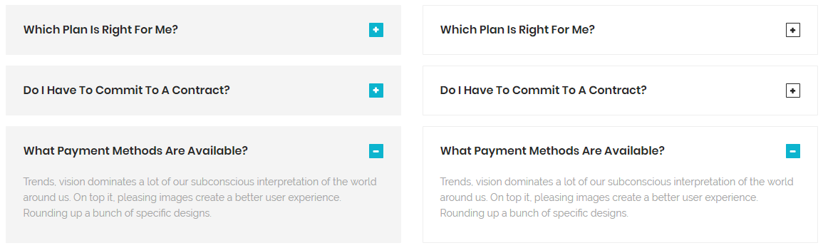
Blockquots elements-blockquots.html
Screenshoot:
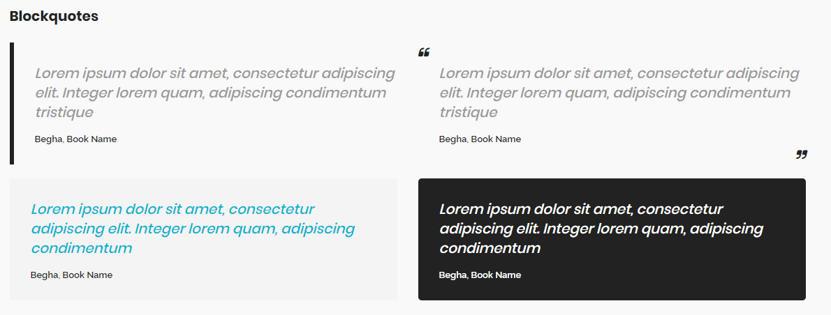
<blockquote> class="blockquote blockquote-1"> ...<span class="quote-author">... </span> </blockquote>
Wrap any content inside blockquote Styles By using this style classes:
- blockquote-1
- blockquote-2
- blockquote-3
- blockquote-4
Buttons elements-buttons.html
Screenshoot:
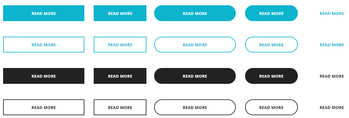
<a class="btn btn--primary" href="#">...</div>
Replace the highlighted yellow text(#) with button link
wrap any content inside button Styles By using this style classes:
- btn--primary
- btn--secondary
- btn--white
if you want to make button rounded add this class btn--rounded
if you want to make button with border add this class btn--bordered
if you want to make button with inverse hover add this class btn--inverse
Carousel
<section  id="clients1" class="clients clients-carousel clients-carousel-1 clients-divider">
     <div class="container">
        <div class="row">
            <div class="col-xs-12 col-sm-12 col-md-12">
                <div class="carousel-divder-reverse"></div>
                <div class="carousel carousel-dots" data-slide="6" data-slide-rs="2" data-autoplay="false" data-nav="false" data-dots="false" data-space="0" data-loop="true" data-speed="3000">
                    <div class="client">
                         <img class="center-block" src="img path" alt="client">
                    </div>
                    <div class="client">
                         <img class="center-block" src="img path" alt="client">
                    </div>
                    <div class="client">
                         <img class="center-block" src="img path" alt="client">
                    </div>
                    <div class="client">
                         <img class="center-block" src="img path" alt="client">
                    </div>
                    <div class="client">
                         <img class="center-block" src="img path" alt="client">
                    </div>
                    <div class="client">
                         <img class="center-block" src="img path" alt="client">
                    </div>
                </div>
            </div>
         </div>
     </div>
 </div>
All Carousel has some data attributes which can control carousel form it:
| Attributes | Description |
|---|---|
data-slide="6" |
Number of carousel items to be show |
data-slide-rs="2" |
Number of carousel items to be show in mobile screens which width more than 600px |
data-autoplay="false" |
Enable or Disable carousel auto play |
data-nav="false" |
Enable or Disable carousel navigation arrows, you can use one of navigation style by using this classes: carousel-navs slider-navs |
data-dots="false" |
Enable or Disable carousel dots , you can use one of navigation style by using this classes: carousel-dots carousel-dots carousel-white |
data-space="0" |
Size of space between carousel items |
data-loop="true" |
Enable or Disable carousel items loop |
data-speed="3000" |
Speed of transition carousel |
Wrap any content inside clients carousel Styles By using this style classes:
- clients-carousel-1
- clients-carousel-2
- clients-carousel-3
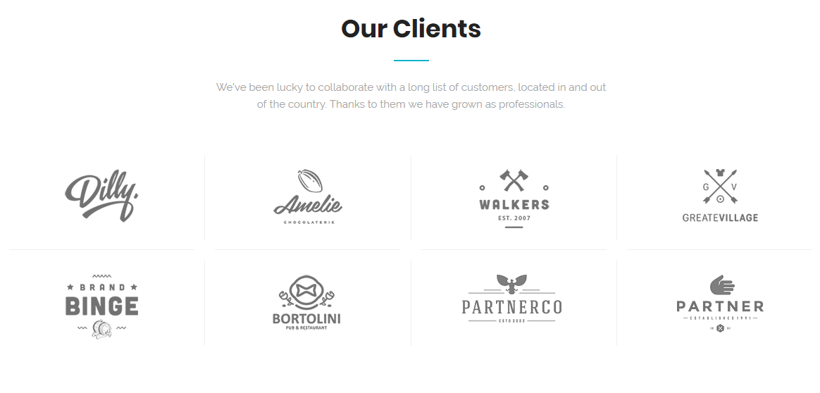
Clients elements-clients.html
Screenshoot:
<section  id="clients1" class="clients">
     <div class="container">
        <div class="row">
            <div class="col-xs-12 col-sm-12 col-md-12">
                 <div class="row row-clients">
                    <div class="col-xs-12 col-sm-3 col-md-3 client">
                         <img class="center-block" src="img path" alt="client">
                    </div>
                    <div class="col-xs-12 col-sm-3 col-md-3 client">
                         <img class="center-block" src="img path" alt="client">
                    </div>
                    <div class="col-xs-12 col-sm-3 col-md-3 client">
                         <img class="center-block" src="img path" alt="client">
                    </div>
                    <div class="col-xs-12 col-sm-3 col-md-3 client">
                         <img class="center-block" src="img path" alt="client">
                    </div>
                </div>
                <div class="row row-clients">
                    <div class="col-xs-12 col-sm-3 col-md-3 client">
                         <img class="center-block" src="img path" alt="client">
                    </div>
                    <div class="col-xs-12 col-sm-3 col-md-3 client">
                         <img class="center-block" src="img path" alt="client">
                    </div>
                    <div class="col-xs-12 col-sm-3 col-md-3 client">
                         <img class="center-block" src="img path" alt="client">
                    </div>
                    <div class="col-xs-12 col-sm-3 col-md-3 client">
                         <img class="center-block" src="img path" alt="client">
                    </div>
                </div>
            </div>
         </div>
     </div>
 </div>
wrap any content inside clients Styles By using this style classes:
- clients-1
- clients-2
- clients-3
Contact Form elements-contact-form.html
Screenshoot:
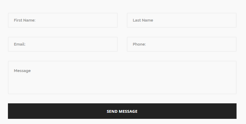
<section  id="contact" class="contact contact-1">
     <div class="container">
        <div class="row">
            <div class="col-xs-12 col-sm-12 col-md-8 col-md-offset-2">
                 <div class="contact-form">
                     <form method="post" action="assets/php/contact.php" class="contactForm mb-0">
                        <div class="row">
                            <div class="col-md-6">
                                 <input type="text" class="form-control" name="contact-name" id="first-name" placeholder="First Name:" required>
                            </div>
                            <div class="col-md-6">
                                 <input type="text" class="form-control" name="contact-last" id="last-name" placeholder="Last Name" required>
                            </div>
                            <div class="col-md-6">
                                 <input type="email" class="form-control" name="contact-email" id="contact-email" placeholder="Email:" required>
                            </div>
                            <div class="col-md-6">
                                 <input type="text" class="form-control" name="contact-phone" id="phone" placeholder="Phone:" required>
                            </div>
                            <div class="col-md-12">
                                 <textarea class="form-control" name="contact-message" id="message" rows="2" placeholder="Message" required></textarea>
                            </div>
                            <div class="col-md-12">
                                 <input type="submit" value="Send Message" name="submit" class="btn btn--secondary btn--block">
                            </div>
                        </div>
                    </form>
                </div>
              </div>
            </div>
         </div>
     </div>
 </div>
wrap any content inside contact forms
- contact-1
- contact-2
- contact-3
countdown elements-countdown.html
Screenshoot:
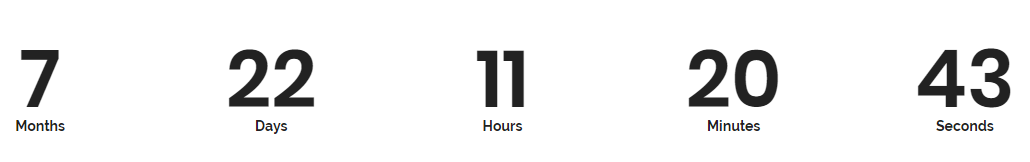
<section id="countdown1" class="count-down countdown-theme bg-white">
	<div class="container">
		<div class="row">
			<div class="col-xs-12 col-sm-12 col-md-12">
				<div class="countdown" data-count-date="2018, 12, 31"></div>
			</div>
		</div>
	</div>
</section>
-
data-count-date="
type the date that you want to countdown2018, 12, 31"
counter elements-counters.html
Screenshoot:
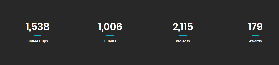
<section id="counter1" class="counter counter-1 bg-dark2">
     <div class="container">
        <div class="row">
            <div class="col-xs-6 col-sm-3 col-md-3">
                 <div class="count-box text-center">
                     <div class="counting">...</div>
                     <div class="divider--line divider--center"></div>
                     <div class="count-title">...</div>
                </div>
            </div>
          </div>
     </div>
 </div>
-
<div class="counting">
type the numbers that you want to count to for example 1200...</div>
wrap any content inside counter
- counter-1
- counter-2
- counter-3
- counter-4
call to action elements-cta.html
Screenshoot:

<section id="counter1" class="counter counter-1 bg-dark2">
     <div class="container">
        <div class="row">
            <div class="col-xs-12 col-sm-12 col-md-10">
                <h3>...</h3>
            </div>
            <div class="col-xs-12 col-sm-12 col-md-2 text-right">
                <a class="btn btn--primary btn--hover-white">...</a>
            </div>
          </div>
     </div>
 </div>
wrap any content inside cta
- cta-1
- cta-2
- cta-3
- cta-4
- cta-5
- cta-6
- cta-7
Device Mockups elements-device-mockups.html
Screenshoot:
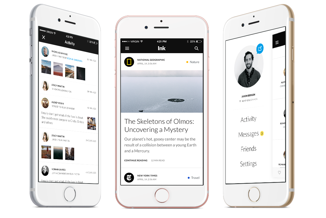
< id="mockups1" class="mockups mockups-1 bg-white">
    <div class="container">
        <div class="row clearfix">
            <div class="col-xs-12 col-sm-12 col-md-6 col-md-offset-3">
                <div class="heading heading-2 mb-30 text--center">
                    <h2 class="heading--title">Beautiful Design</h2>
                    <div class="divider--line divider--center"></div>
                    <p class="heading--desc mb-0">We've been lucky to collaborate with a long list of customers, located in and out of the country. Thanks to them we have grown as professionals.</p>
                </div>
            </div>
        </div>
        <div class="row">
            <div class="col-xs-12 col-sm-12 col-md-4">
                <div class="pull-right">
                    <img class="img-responsive" src="type img path" alt="app screenshots">
                </div>
            </div>
            <div class="col-xs-12 col-sm-12 col-md-4">
                <div class="text-center pt-40">
                    <img src="type img path" alt="app screenshots">
                </div>
            </div>
            <div class="col-xs-12 col-sm-12 col-md-4">
                <div class="pull-left">
                    <img class="img-responsive" src="type img path" alt="app screenshots">
                </div>
            </div>
        </div>
    </div>
 </section>
wrap any content inside Device Mockups
- mockups-1
- mockups-2
- mockups-3
- mockups-4
- mockups-5
- mockups-6
Event elements-event.html
Screenshoot:
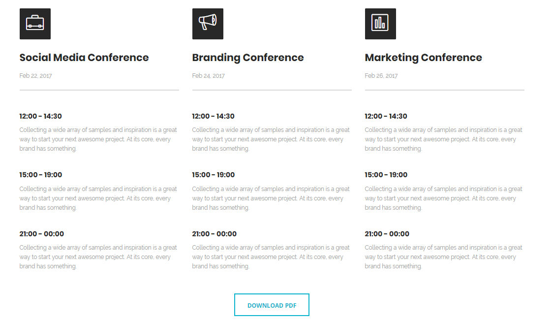
<section id="calendar" class="calendar bg-white">
     <div class="container">
        <div class="row">
            <div class="col-xs-12 col-sm-4 col-md-4">
                <div class="calendar-panel">
                    <div class="calendar--heading">
                        <div class="calendar--icon">
                            <i class="lnr lnr-briefcase"></i>
                       </div>
                        <h2>Social Media Conference></h2>
                            <p>...</p>
                        <div class="divider--line"></div>
                    </div>
                    <div class="calendar--body">
                    <div class="calendar--date">
                        <h6>...></h6>
                        <p>...</p>
                    </div>
                     <div class="calendar--date">
                        <h6>...></h6>
                        <p>...</p>
                    </div>
                    <div class="calendar--date">
                        <h6>...></h6>
                        <p>...</p>
                    </div>
                 </div>
                </div>
                <div class="col-xs-12 col-sm-4 col-md-4">
                    <div class="calendar-panel">
                        <div class="calendar--heading">
                            <div class="calendar--icon">
                                <i class="lnr lnr-bullhorn"></i>
                           </div>
                            <h2>Social Media Conference></h2>
                                <p>...</p>
                            <div class="divider--line"></div>
                        </div>
                        <div class="calendar--body">
                        <div class="calendar--date">
                            <h6>...></h6>
                            <p>...</p>
                        </div>
                         <div class="calendar--date">
                            <h6>...></h6>
                            <p>...</p>
                        </div>
                        <div class="calendar--date">
                            <h6>...></h6>
                            <p>...</p>
                        </div>
                     </div>
                </div>
                <div class="col-xs-12 col-sm-4 col-md-4">
                    <div class="calendar-panel">
                        <div class="calendar--heading">
                            <div class="calendar--icon">
                                <i class="lnr lnr-chart-bars"></i>
                           </div>
                            <h2>Social Media Conference></h2>
                                <p>...</p>
                            <div class="divider--line"></div>
                        </div>
                        <div class="calendar--body">
                        <div class="calendar--date">
                            <h6>...></h6>
                            <p>...</p>
                        </div>
                         <div class="calendar--date">
                            <h6>...></h6>
                            <p>...</p>
                        </div>
                        <div class="calendar--date">
                            <h6>...></h6>
                            <p>...</p>
                        </div>
                     </div>
                </div>
               </div>
            </div>
         </div>
         <div class="row clearfix">
            <div class="col-xs-12 col-sm-12 col-md-12">
                <div class="text-center mt-10">
                    <a class="btn btn--primary btn--bordered" href="#">...</a>
                </div>
            </div>
         </div>
     </div>
  </section>
the highlighted text with yellow color is icon you can change it from linear icons or here Fontawesome icons
heading elements-heading.html
Screenshoot:
<div class="calendar--heading">
    <p class="heading--subtitle">...</p>
    <h2 class="heading--title">...</h2>
    <div class="divider--line divider--center"></div>
    <p class="heading--desc mb-0">...</p>
</div>
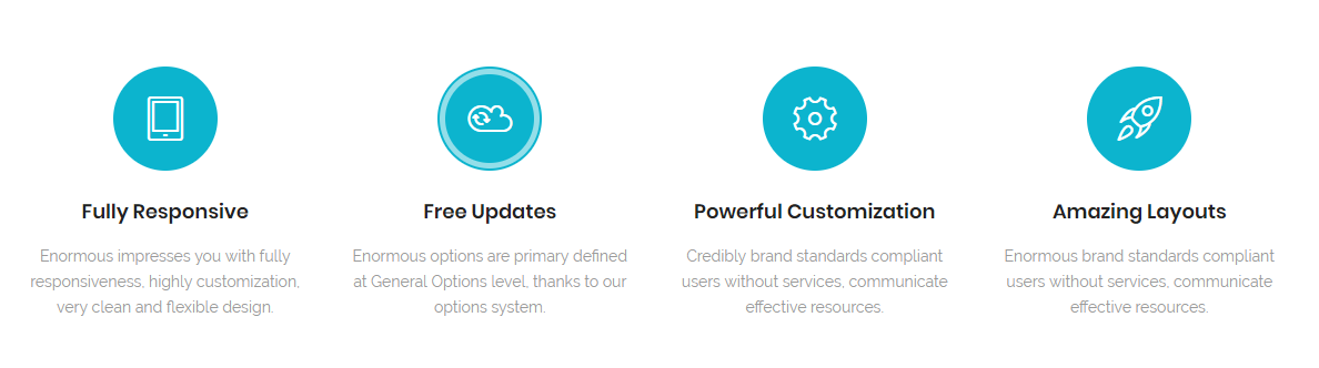
icon text elements-icon-text.html
Screenshoot:
<section id="feature1" class="feature feature-1 text-center bg-white">
    <div class="container">
        <div class="row">
            <div class="col-xs-12 col-sm-6 col-md-3">
                <div class="feature-panel">
                    <div class="feature--icon">
                        <i class="lnr lnr-tablet"></i>
                    </div>
                    <div class="feature--content">
                        <h3>...</h3>
                        <p>...</p>
                    </div>
                </div>
            <div class="col-xs-12 col-sm-6 col-md-3">
                <div class="feature-panel">
                    <div class="feature--icon">
                        <i class="lnr lnr-cloud-sync"></i>
                    </div>
                    <div class="feature--content">
                        <h3>...</h3>
                        <p>...</p>
                    </div>
                </div>
            <div class="col-xs-12 col-sm-6 col-md-3">
                <div class="feature-panel">
                    <div class="feature--icon">
                        <i class="lnr lnr-cog"></i>
                    </div>
                    <div class="feature--content">
                        <h3>...</h3>
                        <p>...</p>
                    </div>
                </div>
            <div class="col-xs-12 col-sm-6 col-md-3">
                <div class="feature-panel">
                    <div class="feature--icon">
                        <i class="lnr lnr-rocket"></i>
                    </div>
                    <div class="feature--content">
                        <h3>...</h3>
                        <p>...</p>
                    </div>
                </div>
            </div>
        </div>
</section>
the highlighted text with yellow color is icon you can change it from linear icons or here Fontawesome icons
wrap any content inside feature
- feature-1
- feature-2
- feature-3
- feature-4
- feature-5
- feature-6
- feature-7
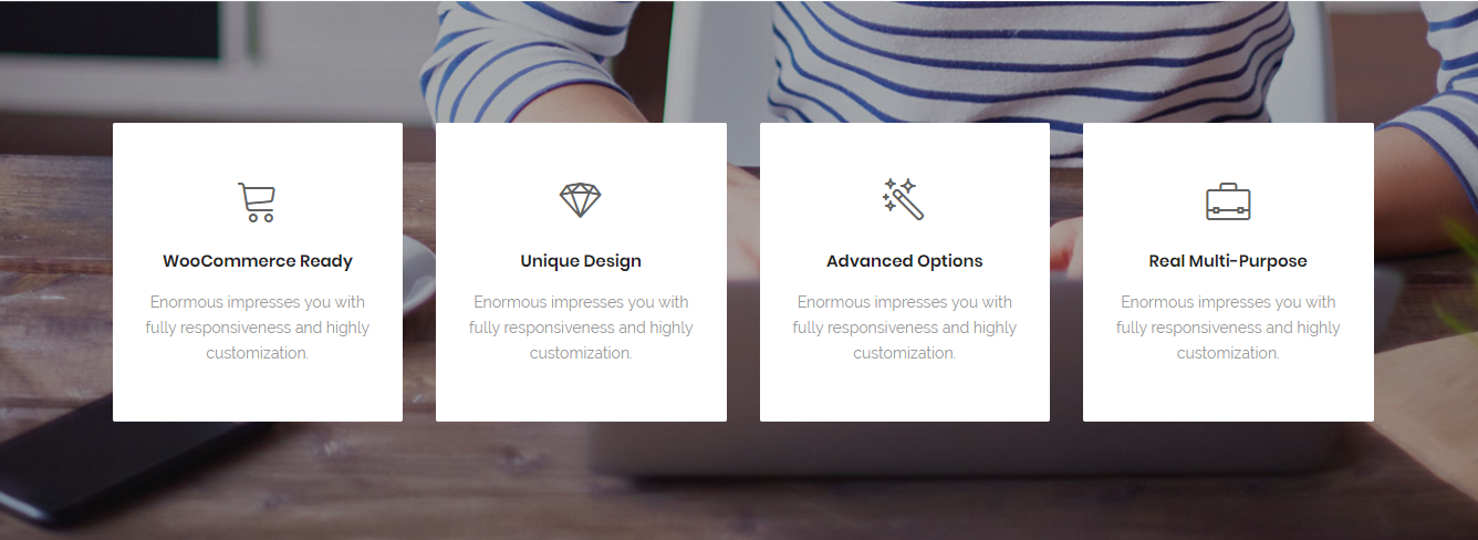
info box elements-info-box.html
Screenshoot:
<section id="infoBox1" class="feature info-box text-center bg-overlay bg-overlay-dark">
       <div class="bg-section">
        <img src="assets/images/background/1.jpg" alt="Background"/>
    </div>
    <div class="container">
        <div class="row">
            <div class="col-xs-12 col-sm-12 col-md-3">
                <div class="feature-panel">
                    <div class="feature--icon">
                        <i class="lnr lnr-cart"></i>
                    </div>
                    <div class="feature--content">
                        <h3>...</h3>
                        <p>...</p>
                    </div>
                </div>
            <div class="col-xs-12 col-sm-6 col-md-3">
                <div class="feature-panel">
                    <div class="feature--icon">
                        <i class="lnr lnr-diamond"></i>
                    </div>
                    <div class="feature--content">
                        <h3>...</h3>
                        <p>...</p>
                    </div>
                </div>
            <div class="col-xs-12 col-sm-6 col-md-3">
                <div class="feature-panel">
                    <div class="feature--icon">
                        <i class="lnr lnr-magic-wand"></i>
                    </div>
                    <div class="feature--content">
                        <h3>...</h3>
                        <p>...</p>
                    </div>
                </div>
            <div class="col-xs-12 col-sm-6 col-md-3">
                <div class="feature-panel">
                    <div class="feature--icon">
                        <i class="lnr lnr-briefcase"></i>
                    </div>
                    <div class="feature--content">
                        <h3>...</h3>
                        <p>...</p>
                    </div>
                </div>
            </div>
        </div>
</section>
the highlighted text with yellow color is icon you can change it from linear icons or here Fontawesome icons
wrap any content inside feature
- feature-1
- feature-2
- feature-3
- feature-4
- feature-5
- feature-6
- feature-7
interactive banners elements-interactive-banners.html
Screenshoot:

<section id="banners1" class="interactive pt-0 pb-0">
    <div class="container-fluid">
        <div class="row">
            <div class="banner-panel bg-dark3">
                <div class="panel--content">
                    <div class="num">01.</div>
                    <h6>...</h6>
                    <h3>...</h3>
                    <p>...</p>
                </div>
            </div>
            <div class="banner-panel bg-dark2">
                <div class="panel--content">
                    <div class="num">02.</div>
                    <h6>...</h6>
                    <h3>...</h3>
                    <p>...</p>
                </div>
            </div>
            <div class="banner-panel bg-dark">
                <div class="panel--content">
                    <div class="num">03.</div>
                    <h6>...</h6>
                    <h3>...</h3>
                    <p>...</p>
                </div>
            </div>
        </div>
    </div>
</section>
wrap any content inside banners
- banner-1
- banner-2
- banner-3
- banner-4
- banner-5
- banner-6
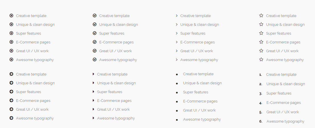
list elements-list.html
Screenshoot:
<section>
    <div class="container">
        <div class="row">
            <div class="col-md-3">
                <ul class="list icon-list">
                    <li><i class="fa fa-play-circle-o"></i>...</li>
                </ul>
            </div>
        </div>
    </div>
</section>
the highlighted text with yellow color is icon you can change it from linear icons or here Fontawesome icons
newsletterelements-newsletter.html
Screenshoot:
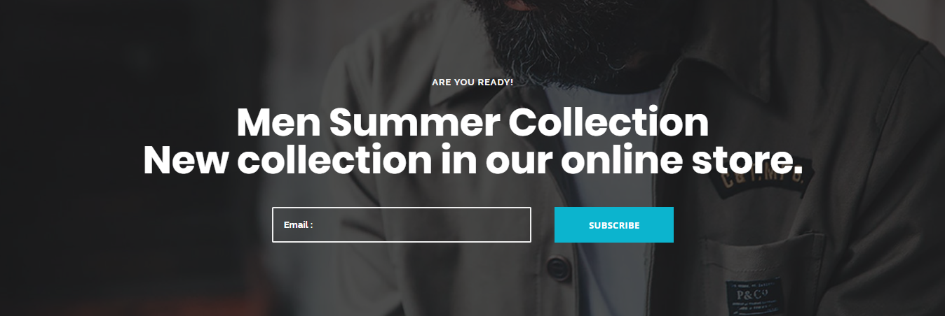
<section id="newsletter" class="newsletter text-center bg-overlay bg-overlay-dark2>
   		<div class="bg-section">
			<img src="type img path" alt="Background"/>
		</div>
    <div class="container">
        <div class="row">
            <div class="col-xs-12 col-sm-12 col-md-12">
                <p><....</p>
                <h3><....</h3>
                <form class="form-inline mb-0">
					<input type="email" class="form-control" id="email" placeholder="Email :">
				 	<button type="submit" class="btn btn--primary">Subscribe</button>
				</form>
            </div>
        </div>
    </div>
</section>
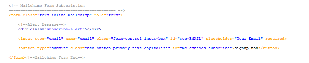
The newsletter is actually an integration of MailChimp or campaignmonitor. You can easily set-up a free account at mailchimp OR campaign monitor
Working with mailchimp
1.find mailchimp url
Go to your mailchimp account. Then go to your existing list. Then Signup forms. Select Embedded forms. You will find form action URL in this page.
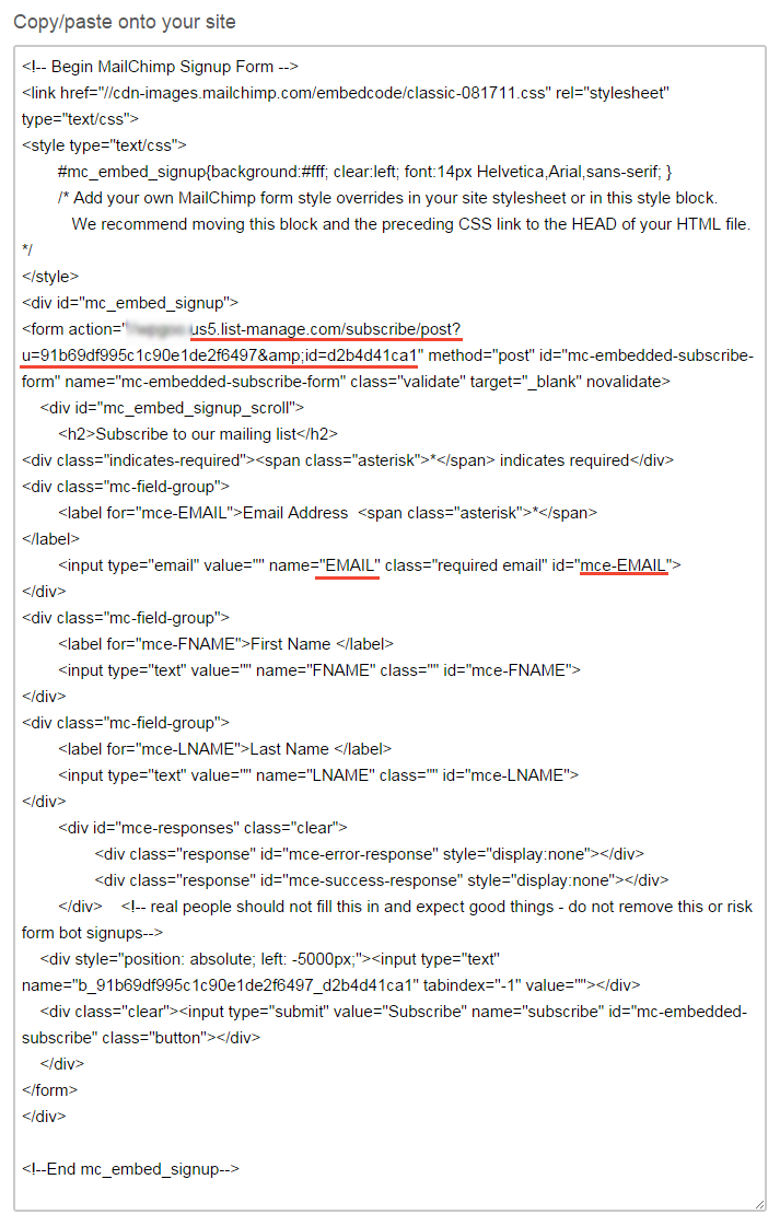
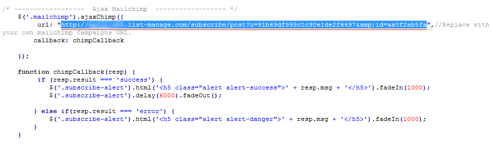
2.connect mail chimp
Open functions.js and find following script. Just replace that mailchimp form action url with your mailchimp list url.
working with campaign monitor
1.find campaign monitor url
Paste your existing subscribe form in the area designated just after and Take your Campaign Monitor subscribe form... in the code. If you don't yet have a subscription form
more about AJAX Subscription Form and steps here.
2.replace mailchimp code form with campaign monitor code form
replace:
with:
<!-- Campaignmonitor Form Subscription
============================================= -->
<form class="form-inline" action="Your Form Action URL" method="post" id="campaignmonitor">
    <p>
        <input id="fieldEmail" class="form-control input-box" name="cm-jidjdl-jidjdl" type="email" required />
    </p>
    <p>
        <button type="submit" class="btn button-primary text-capitalize">signup me now</button>
    </p>
</form>
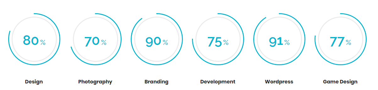
pie chartelements-pie-charts.html
Screenshoot:
<section id="piechart1" class="pie-chart pie-chart-1 bg-white">
    <div class="container">
        <div class="row">
            <div class="col-xs-12 col-sm-6 col-md-2 text-center">
                <div class="skill">
                    <div class="rounded-skill" data-percent="80" data-width="3" data-color="#0cb4ce" data-size="166" data-line="square">
                        <div class="prcentage">
                            <span class="prcent">..</span>
                            <span class="symbol">%</span>
                        </div>
                        </div>
                        <div class="clearfix"></div>
                        <div class="skill-name">
                            <h6>...</h6>
                    </div>
                </div>
            </div>
            <div class="col-xs-12 col-sm-6 col-md-2 text-center">
                <div class="skill">
                    <div class="rounded-skill" data-percent="70" data-width="3" data-color="#0cb4ce" data-size="166" data-line="square">
                        <div class="prcentage">
                            <span class="prcent">..</span>
                            <span class="symbol">%</span>
                        </div>
                        </div>
                        <div class="clearfix"></div>
                        <div class="skill-name">
                            <h6>...</h6>
                    </div>
                </div>
            </div>
            <div class="col-xs-12 col-sm-6 col-md-2 text-center">
                <div class="skill">
                    <div class="rounded-skill" data-percent="90" data-width="3" data-color="#0cb4ce" data-size="166" data-line="square">
                        <div class="prcentage">
                            <span class="prcent">..</span>
                            <span class="symbol">%</span>
                        </div>
                        </div>
                        <div class="clearfix"></div>
                        <div class="skill-name">
                            <h6>...</h6>
                    </div>
                </div>
            </div>
            <div class="col-xs-12 col-sm-6 col-md-2 text-center">
                <div class="skill">
                    <div class="rounded-skill" data-percent="95" data-width="3" data-color="#0cb4ce" data-size="166" data-line="square">
                        <div class="prcentage">
                            <span class="prcent">..</span>
                            <span class="symbol">%</span>
                        </div>
                        </div>
                        <div class="clearfix"></div>
                        <div class="skill-name">
                            <h6>...</h6>
                    </div>
                </div>
            </div>
            <div class="col-xs-12 col-sm-6 col-md-2 text-center">
                <div class="skill">
                    <div class="rounded-skill" data-percent="91" data-width="3" data-color="#0cb4ce" data-size="166" data-line="square">
                        <div class="prcentage">
                            <span class="prcent">..</span>
                            <span class="symbol">%</span>
                        </div>
                        </div>
                        <div class="clearfix"></div>
                        <div class="skill-name">
                            <h6>...</h6>
                    </div>
                </div>
            </div>
            <div class="col-xs-12 col-sm-6 col-md-2 text-center">
                <div class="skill">
                    <div class="rounded-skill" data-percent="77" data-width="3" data-color="#0cb4ce" data-size="166" data-line="square">
                        <div class="prcentage">
                            <span class="prcent">..</span>
                            <span class="symbol">%</span>
                        </div>
                        </div>
                        <div class="clearfix"></div>
                        <div class="skill-name">
                            <h6>...</h6>
                    </div>
                </div>
            </div>
        </div>
    </div>
</section>
the highlighted text with yellow color is the chart percentace you can change it
| Attributes | Description |
|---|---|
data-percen="80" |
chart percet |
data-width="3" |
chart border width |
data-color="0cb4ce" |
chart color |
data-size="166" |
chart size |
data-line="square" |
chart line |
wrap any content inside pie chart
- pie-chart-1
- pie-chart-2
- pie-chart-3
pricingelements-pricing.html
Screenshoot:
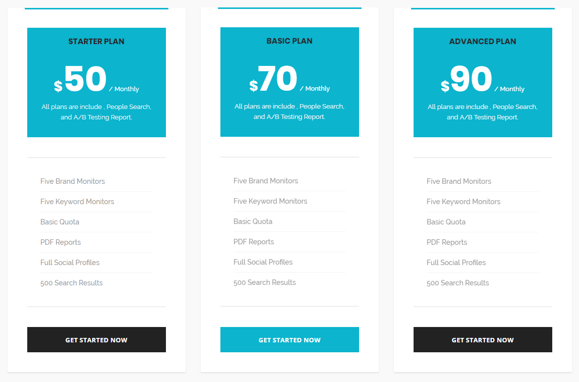
<section id="pricing1" class="pricing pricing-1">
    <div class="container">
        <div class="row">
            <div class="col-xs-12 col-sm-4 col-md-4 price-table">
                <div class="pricing-panel">
                    <div class="pricing--heading bg-theme text--center">
                        <h4>...</h4>
                        <p><span class="currency">$</span>...<span class="time"> / ...</span></p>
                        <div class="pricing--desc">...</div>
                    </div>
                    <div class="pricing--body">
                        <ul class="pricing--list list-unstyled">
                            <li>...</li>
                            <li>...</li>
                            <li>...</li>
                            <li>...</li>
                            <li>...</li>
                            <li>...</li>
                        </ul>
                    <a class="btn btn--secondary btn--block" href="#">...</a>
                </div>
            </div>
        </div>
        <div class="col-xs-12 col-sm-4 col-md-4 price-table">
            <div class="pricing-panel pricing-active">
                <div class="pricing--heading bg-theme text--center">
                    <h4>...</h4>
                    <p><span class="currency">$</span>...<span class="time"> / ...</span></p>
                    <div class="pricing--desc">...</div>
                </div>
                <div class="pricing--body">
                    <ul class="pricing--list list-unstyled">
                        <li>...</li>
                        <li>...</li>
                        <li>...</li>
                        <li>...</li>
                        <li>...</li>
                        <li>...</li>
                    </ul>
                <a class="btn btn--secondary btn--block" href="#">...</a>
            </div>
        </div>
        </div>
            <div class="col-xs-12 col-sm-4 col-md-4 price-table">
                <div class="pricing-panel">
                    <div class="pricing--heading bg-theme text--center">
                        <h4>...</h4>
                        <p><span class="currency">$</span>...<span class="time"> / ...</span></p>
                        <div class="pricing--desc">...</div>
                    </div>
                    <div class="pricing--body">
                        <ul class="pricing--list list-unstyled">
                            <li>...</li>
                            <li>...</li>
                            <li>...</li>
                            <li>...</li>
                            <li>...</li>
                            <li>...</li>
                        </ul>
                    <a class="btn btn--secondary btn--block" href="#">...</a>
                </div>
            </div>
        </div>
    </div>
  </div>
</section>
Replace the highlighted yellow text(#) with button link
wrap any content inside pricing
- pricing-1
- pricing-2
- pricing-3
- pricing-4
- pricing-5
progress barelements-progress-bar.html
Screenshoot:
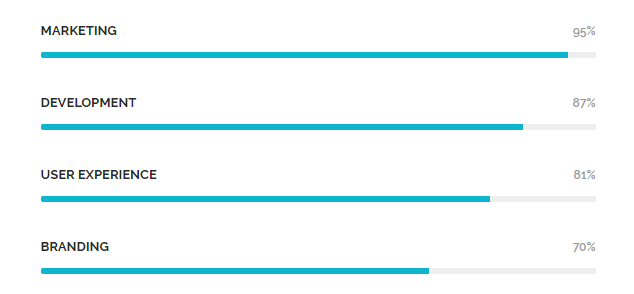
<section id="skills1" class="skills">
<div class="container">
    <div class="row">
        <div class="col-xs-12 col-sm-12 col-md-6">
            <div class="progressbar">
                <div class="progress-title">
                    <span class="title">...</span>
                    <span class="value">95%</span>
                </div>
                <div class="progress">
                    <div class="progress-bar" role="progressbar" aria-valuenow="95" aria-valuemin="0" aria-valuemax="100"></div>
                </div>
            </div>
        </div>
        <div class="col-xs-12 col-sm-12 col-md-6">
            <div class="progressbar">
                <div class="progress-title">
                    <span class="title">...</span>
                    <span class="value">87%</span>
                </div>
                <div class="progress">
                    <div class="progress-bar" role="progressbar" aria-valuenow="95" aria-valuemin="0" aria-valuemax="100"></div>
                </div>
            </div>
        </div>
        <div class="col-xs-12 col-sm-12 col-md-6">
            <div class="progressbar">
                <div class="progress-title">
                    <span class="title">...</span>
                    <span class="value">81%</span>
                </div>
                <div class="progress">
                    <div class="progress-bar" role="progressbar" aria-valuenow="95" aria-valuemin="0" aria-valuemax="100"></div>
                </div>
            </div>
        </div>
        <div class="col-xs-12 col-sm-12 col-md-6">
            <div class="progressbar">
                <div class="progress-title">
                    <span class="title">...</span>
                    <span class="value">70%</span>
                </div>
                <div class="progress">
                    <div class="progress-bar" role="progressbar" aria-valuenow="95" aria-valuemin="0" aria-valuemax="100"></div>
                </div>
            </div>
        </div>
    </div>
</div>
</section>
the highlighted text with yellow color is the chart percentace you can change it
-
aria-valuenow="
progress percent95"
For other styles write this highlited class
- <div class="progressbar progress-gradient">
- or
- <div class="progressbar progress-gradient2">
serviceselements-services.html
Screenshoot:
<section id="services1" class="services bg-white">
    <div class="container">
        <div class="row">
            <div class="col-xs-12 col-sm-4 col-md-4">
                <div class="service-panel">
                    <img src="type img path" alt="img">
                    <h3>...</h3>
                    <p>...</p>
                    <a class="link-more" href="#">...</a>
                </div>
             </div>
        </div>
  </div>
</section>
Replace the highlighted yellow text(#) with button link
tabselements-team.html
Screenshoot:

<section id="tabs1" class="tabs text-center bg-white">
<div class="container">
    <div class="row">
        <div class="col-xs-12 col-sm-12 col-md-12">
            <ul class="nav nav-tabs">
                <li class="active"><a href="#tab1" data-toggle="tab">...</a></li>
                <li><a href="#tab2" data-toggle="tab">...</a></li>
                <li><a href="#tab3" data-toggle="tab">...</a></li>
            </ul>
            <div class="tab-content">
                <div class="tab-pane fade in active" id="tab1">
                    <p class="mb-0">...</p>
                </div>
                <div class="tab-pane" id="tab2">
                    <p class="mb-0">...</p>
                </div>
                <div class="tab-pane" id="tab3">
                    <p class="mb-0">...</p>
                </div>
            </div>
        </div>
    </div>
</div>
</section>
Make sure you add unique IDs for each Tab Container and Tab Items.
wrap any content inside tabs
- tabs-1
- tabs-2
- tabs-vertical
- tabs-vertical-2
Teamelements-team.html
Screenshoot:
<section id="team1" class="team team-1 bg-white">
<div class="container">
    <div class="row">
         <div class="col-xs-12 col-sm-6 col-md-3">
            <div class="member">
                <div class="member-img">
                    <img src="type img path" alt="member" />
                </div>
                <div class="member-info">
                    <h5>...</h5>
                    <h6>...</h6>
                    <div class="divider--line divider--center"></div>
                <p>...</p>
                </div>
                 <div class="member-social">
                    <a href="#"> <i class="fa fa-facebook"></i> </a>
                    <a href="#"> <i class="fa fa-twitter"></i> </a>
                    <a href="#"> <i class="fa fa-instagram"></i> </a>
                    <a href="#"> <i class="fa fa-linkedin"></i> </a>
                </div>
            </div>
         </div>
     </div>
  </div>
</section>
Replace the highlighted yellow text(#) with link
you can Replace the highlighted pink text with other social icons from here Fontawesome
wrap any content inside team
- team-1
- team-2
- team-3
- team-4
- team-5
- team-6
testimonials elements-testimonials.html
You can choose between 6 testimonial section while you creating your pages. Simply adding section to your page. you can find all widgets in elements-testimonials.html.
<section id="team1" class="team team-1 bg-white">
<div class="container">
    <div class="row">
         <div class="col-xs-12 col-sm-6 col-md-3">
            <div id="testimonial-carousel" class="carousel carousel-dots carousel-theme" data-slide="3" data-slide-rs="1" data-autoplay="false" data-nav="false" data-dots="true" data-space="30" data-loop="true" data-speed="800">
                 <div class="testimonial-panel">
                    <div class="testimonial--icon"></div>
                    <div class="testimonial--body">
                        <p>...</p>
                    </div>
                    <div class="testimonial--meta">
                        <div class="testimonial--meta-img">
                            <img src="type img path" alt="Testimonial Author">
                        </div>
                        <div class="testimonial--meta-content">
                            <h4>...</h4>
                            <p>...</p>
                        </div>
                    </div>
                </div>
            </div>
         </div>
     </div>
  </div>
</section>
wrap any content inside testimonials
- testimonial-1
- testimonial-2
- testimonial-3
- testimonial-4
- testimonial-5
- testimonial-6
- testimonial-7
- testimonial-8
- testimonial-9
timelineelements-timeline.html
Screenshoot:
<section id="timeline" class="timeline bg-white">
<div class="container">
    <div class="row">
         <div class="col-xs-12 col-sm-12 col-md-10 col-md-offset-1">
            <div class="timeline">
                <div class="timeline--item">
                    <div class="timeline--item-date">...</div>
                    <div class="timeline--item-content">
                        <h3>...</h3>
                        <p>...</p>
                    </div>
                </div>
            </div>
         </div>
     </div>
  </div>
</section>
video button elements-video-buttons.html
Screenshoot:

<section id="video-button" class="video-button bg-white">
    <div class="container">
        <div class="row">
            <div class="col-xs-12 col-sm-12 col-md-8 col-md-offset-2">
                <div class="video--content">
                <p> ...</p>
                <h3>...</h3>
                <div class="video--button">
                <a class="popup-video" href="https://www.youtube.com/watch?v=nrJtHemSPW4">
                    <i class="icon icon-Play"></i>
                </a>
                </div>
            </div>
        </div>
    </div>
</section>
the highlighted text with yellow color is the youtube video link you can change it
work process elements-work-process.html
Screenshoot:
elements-work-process.html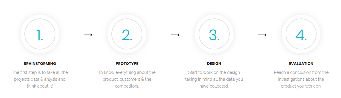
<section id="process1" class="process process-1 bg-white">
    <div class="container">
        <div class="row">
            <div class="col-xs-12 col-sm-6 col-md-3 process-panel text--center">
                <div class="process-img">
                    <div class="process-overlay">
                        <span>1.</span>
                     </div>
                 </div>
                <div class="process-content">
                    <h3>...</h3>
                    <p>...</p>
                </div>
            </div>
        </div>
    </div>
</section>
header
Screenshoot:
<header id="navbar-spy" class="header header-1 header-transparent header-bordered header-fixed">
	<nav id="primary-menu" class="navbar navbar-fixed-top">
		<div class="container">
			<div class="navbar-header">
				<button type="button" class="navbar-toggle collapsed" data-toggle="collapse" data-target="#navbar-collapse-1" aria-expanded="false">
				<span class="sr-only">Toggle navigation</span>
				<span class="icon-bar"></span>
				<span class="icon-bar"></span>
				<span class="icon-bar"></span>
				</button>
				<a class="logo" href="#">
					<img class="logo-light" src="img path" alt="enormous Logo">
					<img class="logo-dark" src="img path" alt="enormous Logo">
				</a>
			</div>
			<div class="collapse navbar-collapse pull-right" id="navbar-collapse-1">

 			</div>
 		</div>
 	</nav>
 </header>
| class | Description | Code Example |
|---|---|---|
header-transparent |
Header with a Transparent Background. |
<header id="navbar-spy" class="header-transparent">
    ...
</header>
|
header-light |
Header with a white Background. |
<header id="navbar-spy" class="header-light">
    ...
</header>
|
header-bordered |
Header with a border from bottom. |
<header id="navbar-spy" class="header-bordered">
    ...
</header>
|
header-fixed |
make header fixed at the top |
<header id="navbar-spy" class="header-fixed">
    ...
</header>
|
header-centered |
make the alignment of header content centered |
<header id="navbar-spy" class="header-centered">
    ...
</header>
|
header-half |
make a border bottom to menu item |
<header id="navbar-spy" class="header-half">
    ...
</header>
|
header-topbar |
you can make add tobar on the header |
<header id="navbar-spy" class="header-topbar">
    ...
</header>
|
nav-pos-right |
align menu position to right |
<header id="navbar-spy" class="header-topbar">
    <ul class="nav navbar-nav nav-pos-right navbar-left">
        ...
    </ul>
</header>
|
Menu
<div class="collapse navbar-collapse pull-right" id="navbar-collapse-1">
    <ul class="nav navbar-nav nav-pos-right navbar-left">
        <li><a href="#">...</a></li>
        <li><a href="#">...</a></li>
        <li><a href="#">...</a></li>
        <li><a href="#">...</a></li>
        <li><a href="#">...</a></li>
    </ul>
</div>
the highlighted text with yellow color is the page link you can replace it with page link
Mega Menu
<div class="collapse navbar-collapse pull-right" id="navbar-collapse-1">
    <ul class="nav navbar-nav nav-pos-right navbar-left">
        <li  class="has-dropdown mega-dropdown active">
           <a href="#" data-toggle="dropdown" class="dropdown-toggle menu-item">...</a>
           <ul class="dropdown-menu mega-dropdown-menu">
               <li>
                   <div class="container">
                       <div class="row">
                           <div class="col-md-3">
                               <ul>
                                   <li><a href="#">...</a></li>
                                   <li><a href="#">...</a></li>
                                   <li><a href="#">...</a></li>
                               </ul>
                           </div>
                            <div class="col-md-3">
                               <ul>
                                   <li><a href="#">...</a></li>
                                   <li><a href="#">...</a></li>
                                   <li><a href="#">...</a></li>
                               </ul>
                           </div>
                           <div class="col-md-3">
                               <ul>
                                   <li><a href="#">...</a></li>
                                   <li><a href="#">...</a></li>
                                   <li><a href="#">...</a></li>
                               </ul>
                           </div>
                       </div>
                   </div>
               </li>
           </ul>
        </li>
        <li><a href="#">...</a></li>
        <li><a href="#">...</a></li>
        <li><a href="#">...</a></li>
        <li><a href="#">...</a></li>
    </ul>
</div>
footer
Screenshoot: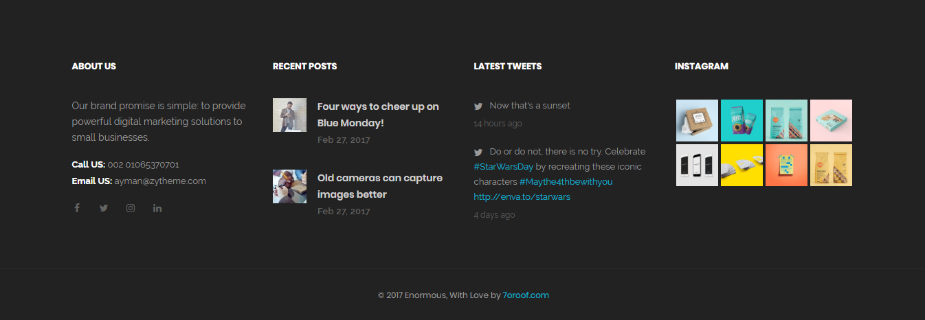
<footer id="footer1" class="footer-1 text-center bg-dark">
    <div class="container">
        <div class="row">
            <div class="col-xs-12 col-sm-6 col-md-3 footer--widget footer--widget-about">
                <div class="footer--widget-title";>
                    <h5;>...</h5;>
                </div;>
                <div class="footer--widget-content">
                <p>...</p>
                <ul class="list-unstyled">
                    <li><span>...</span>...</li>
                    <li><span>...</span>...</li>
                </ul>
                <div class="footer-social-icon">
                    <li><a href="#"><i class="fa fa-facebook"></i></a></li>
                    <li><a href="#"><i class="fa fa-twitter"></i></a></li>
                    <li><a href="#"><i class="fa fa-youtube"></i></a></li>
                    <li><a href="#"><i class="fa fa-google-plus"></i></a></li>
                </div>
            </div>

            <div class="col-xs-12 col-sm-6 col-md-3 footer--widget footer--widget-recent">
                <div class="footer--widget-title";>
                    <h5;>...</h5;>
                </div;>
            <div class="footer--widget-content">
                <div class="entry">
                    <div class="entry--img">
                        <a href="#">
                        <img src="assets/images/footer/thumb-1.jpg" alt="entry image">
                        </a>
                    </div>
                    <div class="entry--content">
                        <div class="entry--title">
                            <a href="#">Four ways to cheer up on Blue Monday!</a>
                        </div>
                        <div class="entry--meta">Feb 27, 2017</div>
                    </div>
                </div>
            </div>

            <div class="footer--bar">
                <div class="container">
                    <div class="row">
                        <div class="col-xs-12 col-sm-12 col-md-12 text--center">
                           <div class="footer--copyright">
                                <span>...</span>
                            </div>
                        </div>
                    </div>
                </div>
            </div>
         </div>
    </div>
</footer>
Slider
Screenshoot: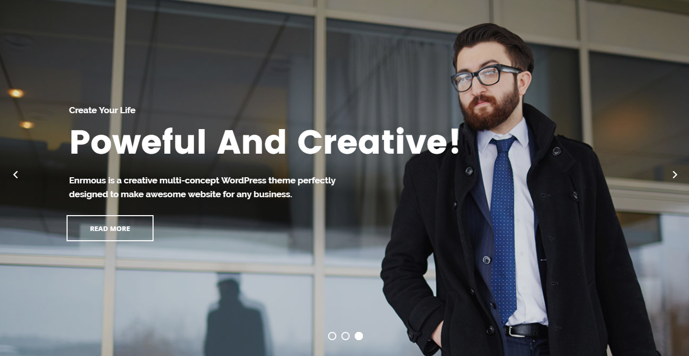
Enormous includes 30+ Sliders built with Revolution Slider
click here to find the Revolution Slider Documentation
portfolio
Screenshoot: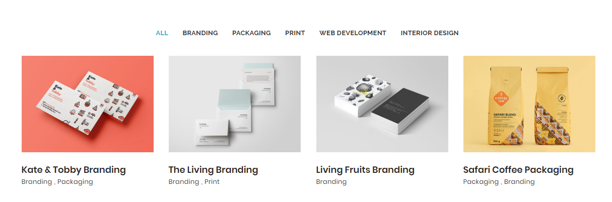
You can choose between portfolio grid options while creating your Pages. Simply select what you need form portfolio pages and work with it. Also we use isotrope to filter portfolio.
portfolio filter
<!-- Portfolio Filter
============================================= -->
<div class="col-xs-12  col-sm-12  col-md-12 portfolio-filter">
	<ul class="list-inline">
		<li><a class="active-filter" href="#" data-filter="*">All</a></li>
		<li><a href="#" data-filter=".filter-photography">Photography</a></li>
		<li><a href="#" data-filter=".filter-video">Video</a></li>
		<li><a href="#" data-filter=".filter-development">Development</a></li>
		<li><a href="#" data-filter=".filter-branding">Branding</a></li>
		<li><a href="#" data-filter=".filter-mockups">Mockups</a></li>
	</ul>
</div>
<!-- .Portfolio-filter end -->
portfolio item
<!-- Portfolio #1 -->
<div class="col-xs-12 col-sm-6 col-md-3  portfolio-item  filter-video">
	<div class=" portfolio-item -body">
	<div class="portfolio-img">
		<img src="assets/images/portfolio/masonary/4col/1.jpg" alt="Portfolio Item">
		<div class="portfolio-hover">

			<div class="portfolio-action">
			<div class="portfolio-zoom-like">
				<a class="img-popup zoom" href="assets/images/portfolio/full/1.jpg" title="Portfolio Item 1">
					<i class="fa fa-search"></i>
				</a>
			</div>
			<div class="portfolio-link">
				<a href="#"><i class="fa fa-link"></i></a>
			</div>
		</div><!-- .Portfolio-action end -->
		</div><!-- .Portfolio-hover end -->
	</div><!-- .Portfolio-img end -->
	<div class="portfolio-bio">
		<div class="portfolio-meta">
				<div class="portfolio-cat">
					<span>In </span><span>Mockups</span>
				</div>
				<div class="portfolio-title">
					<h4>Branding Mockup</h4>
				</div>
			</div><!-- .Portfolio-meta end -->
			<a class="likes" href="#">
				<i class="fa fa-heart"></i><span>125</span>
			</a>
	</div><!-- .portfolio-bio end -->
	</div><!-- . portfolio-item -body end -->
</div><!-- . portfolio-item  end -->
Portfolio types:
- gallery
- classic
- masonry
- without spacing
- full width
Portfolio grid:
- 1 Column
- 2 Column
- 3 Column
- 4 Column
Portfolio single types:
- full width
- right sidebar
- left sidebar
Blog
Screenshoot:
You can choose between blog grid pages while you creating your pages.
Posts use Simple code for post item. Use the Code below:
<!-- Entry #1 -->
<div class="col-xs-12 col-sm-12 col-md-12 clearfix">
	<div class="entry">
	<div class="entry-featured">
		<img src="assets/images/blog/grid/1col/1.jpg" alt="entry title">
	</div><!-- .entry-featured end -->
	<div class="entry-post">
		<div class="entry-meta">
			<span>In : </span><span><a href="#">Interviews</a></span> /
			<span>By : </span><a href="#">Begha</a> /
			<span>On : </span><span> <a href="#">Dec 10, 2014</a></span> /
			<span>Comments : </span><span><a href="#">12</a></span>
		</div><!-- .entry-meta end -->
		<div class="entry-title">
			<h3><a href="#">How To Stablish Your Office ?</a></h3>
		</div><!-- .entry-title end -->
		<div class="entry-cat">
			<i class="fa fa-image"></i>
		</div><!-- .entry-cat end -->
		<div class="entry-content">
			<p>Mauris fermentum porta sem, non hendrerit enim bibendum consectetur. Fusce diam est, porttitor vehicula gravida at, accumsan bibendum tincidunt imperdiet. Maecenas quis magna faucibus, varius ante sit amet, varius augue. Praesent aliquam, augue ac pulvinar accumsan, risus arcu malesuada est, a imperdiet lacus libero ac tellus. Nunc fringilla ullamcorper quam at lacinia. Nullam suscipit mauris quis nibh accumsan, a scelerisque risus imperdiet. Maecenas eget ullamcorper sem, non hendrerit enim bibendum consectetur. Fusce diam est, porttitor vehicula gravida at, accumsan bibendum tincidunt imperdiet.</p>
			<a class="btn btn-primary read-more" href="#">read more <i class="fa fa-angle-double-right"></i></a>
		</div><!-- .entry-content end -->
	</div><!-- .entry-post end -->
	</div><!-- .entry end -->

</div><!-- .col-md-10 end -->
blog types:
- grid
- classic
- masonry
blog grid:
- 1 Column
- 2 Column
- 3 Column
- 4 Column
post types:
- Standard
- Embedded Video
- Embedded Audio
- Text
- Gallery
Credit Files
I've used the following images, icons or other files as listed.
JavaScript Plugins
- jQuery
- bootstrap
- wow
- gmap
- nicescroll
- ajaxchimp
- counter up
- less css
- owl carousel
- isotope
- infinitescroll
- magnific-popup
- Slider Revolution
- waypoints
- owl slider
- images loaded
- jflickr feed
- jquery easypiechart
- moment
- twitter Fetcher
CSS Files
Icons
Images
Support
If you need any help. Feel free to contact me anytime. I will reply in 24 hours. Send a mail from Themeforest Profile.
changelog
Initial Release V1.0
Released on May 9 2018.